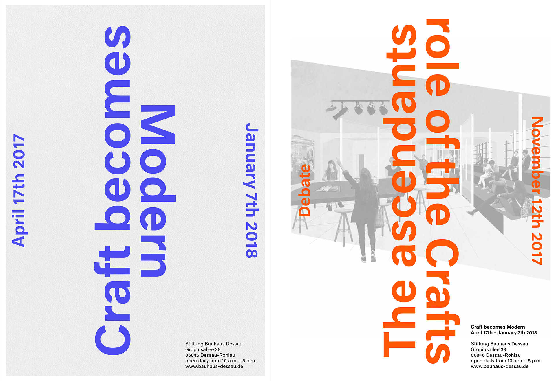
At the invitation of the Bauhaus Institute, we were asked to pitch for the exposition: ‘Craft becomes modern! About production at the Bauhaus’
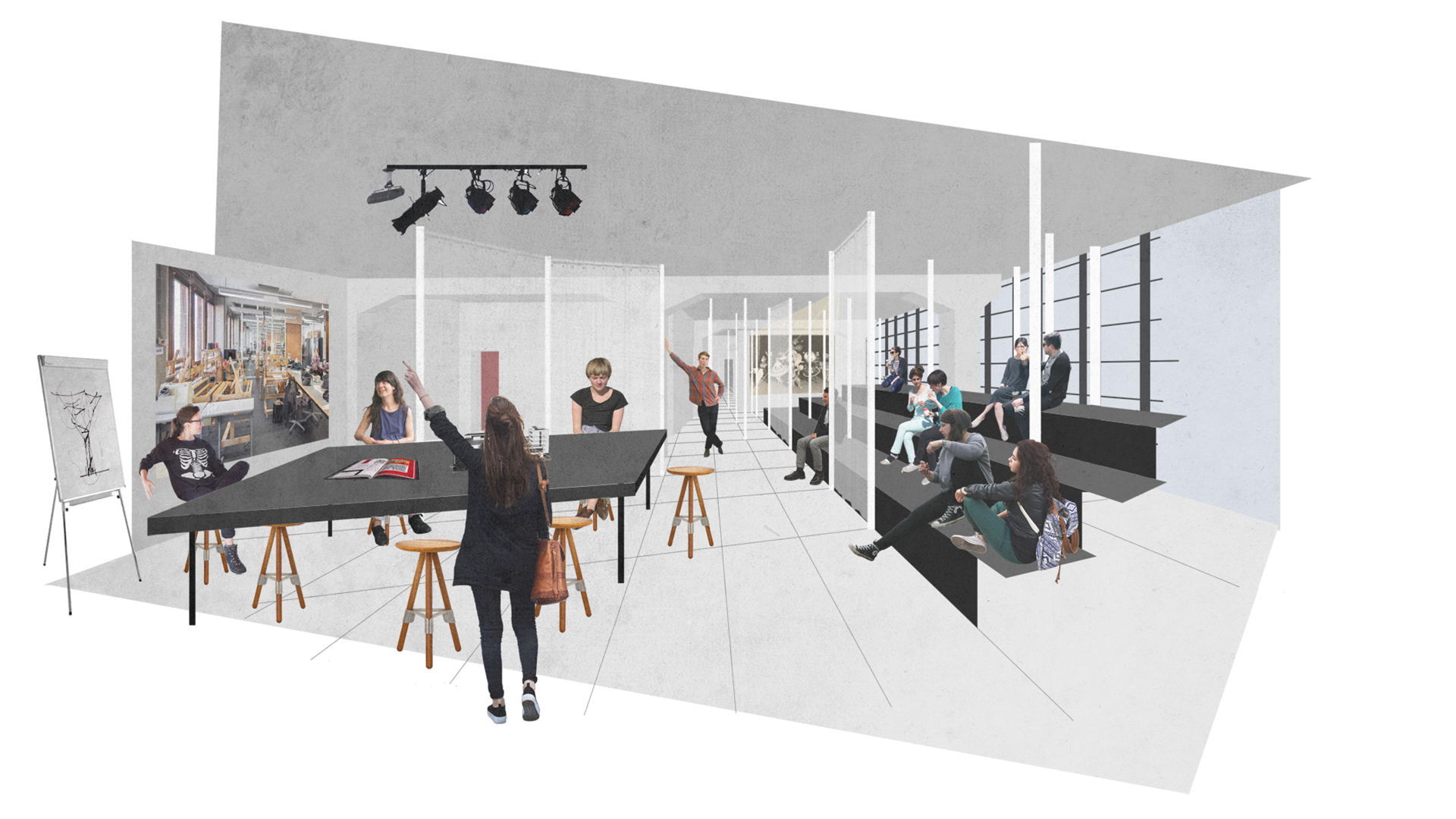
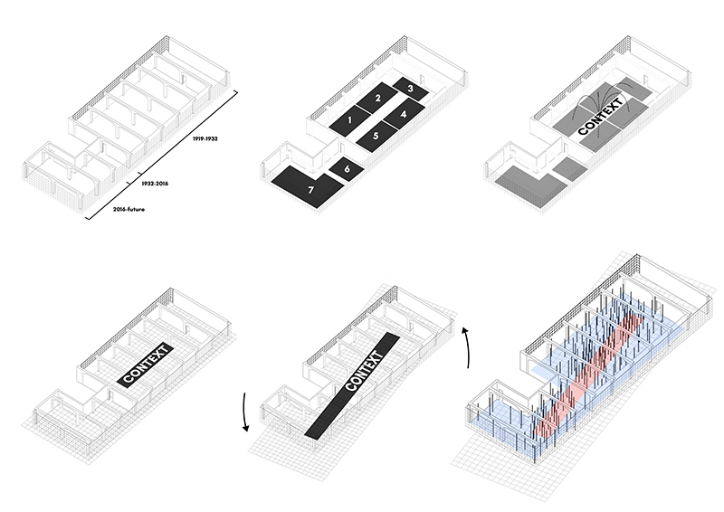
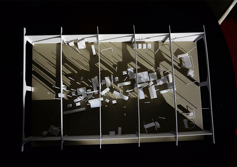
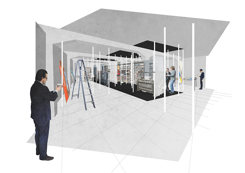
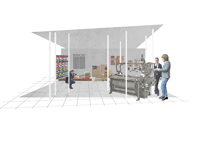
In collaboration with Kummer and Herrman the design of the exposition was based upon a single strong concept: a continuous space with a central core made from context related objects, surrounded by a perimeter of progress and adaptation, showing the five various craftsmanship themes.
A continuous space with a central core showing the five various craftsmanship themes.
The space between core and perimeter is then used as the representation of a complex teacher student relationship. It represents the adaptive attitude that allows for progress and change. A process that inevitably leads to reversed positions: museum becomes school, school becomes museum. An exposition specifically designed to transcend the boundaries of the Bauhaus building and to interact with international visitors through workshops, lectures and ‘artists in residence’.
Facts
Project name: Exhibition design ‘Craft becomes modern!’
Location: Dessau, Germany
Program: Exhibiton design and workshop space
Plot area: ca. 300 m2
Credits
Design team: Tom van Odijk, David Baars, Flavio Martella
Graphic design: Kummer & Herrman


