In both programmatic and visual terms, the building typology of a monofunctional parking garage is a platitude for its urban scenery. In environmental terms it is the car that causes the most damage: carbon footprint, harmful emission, congestion, human laziness, and insalubrity. Since car and parking are inherently related to each other in the setting of the urban fabric, both need to be addressed.
“The improvement of public accessibility and urban vibrancy, compensation for air pollution and its global effects and encouraging physical exercise.”
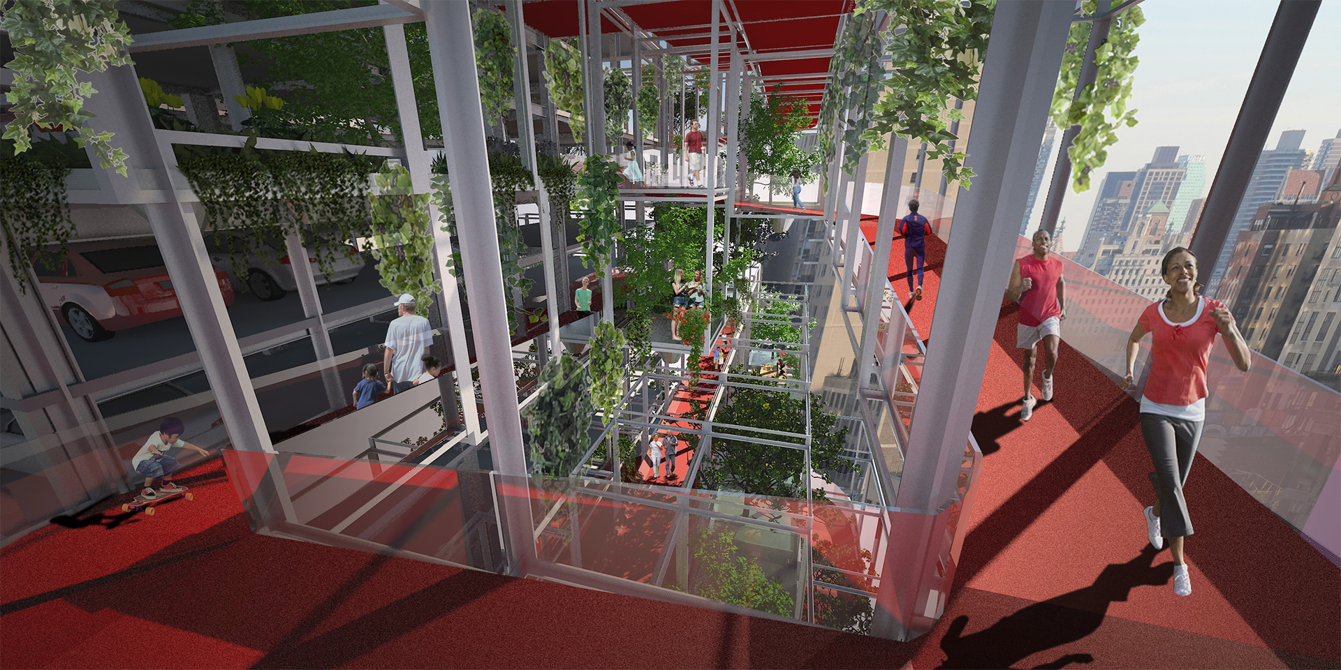
Rather than just an anonymous storage of cars, our design embodies the concept of counterbalance, positive things that help restore the equilibrium that was unbalanced by the negative consequences listed above. The improvement of public accessibility and urban vibrancy, compensation for air pollution and its global effects and encouraging physical exercise. These elements together actually form the second function; compensatory measures to ensure that everyone will benefit. A building equally attractive for people with or without a car!
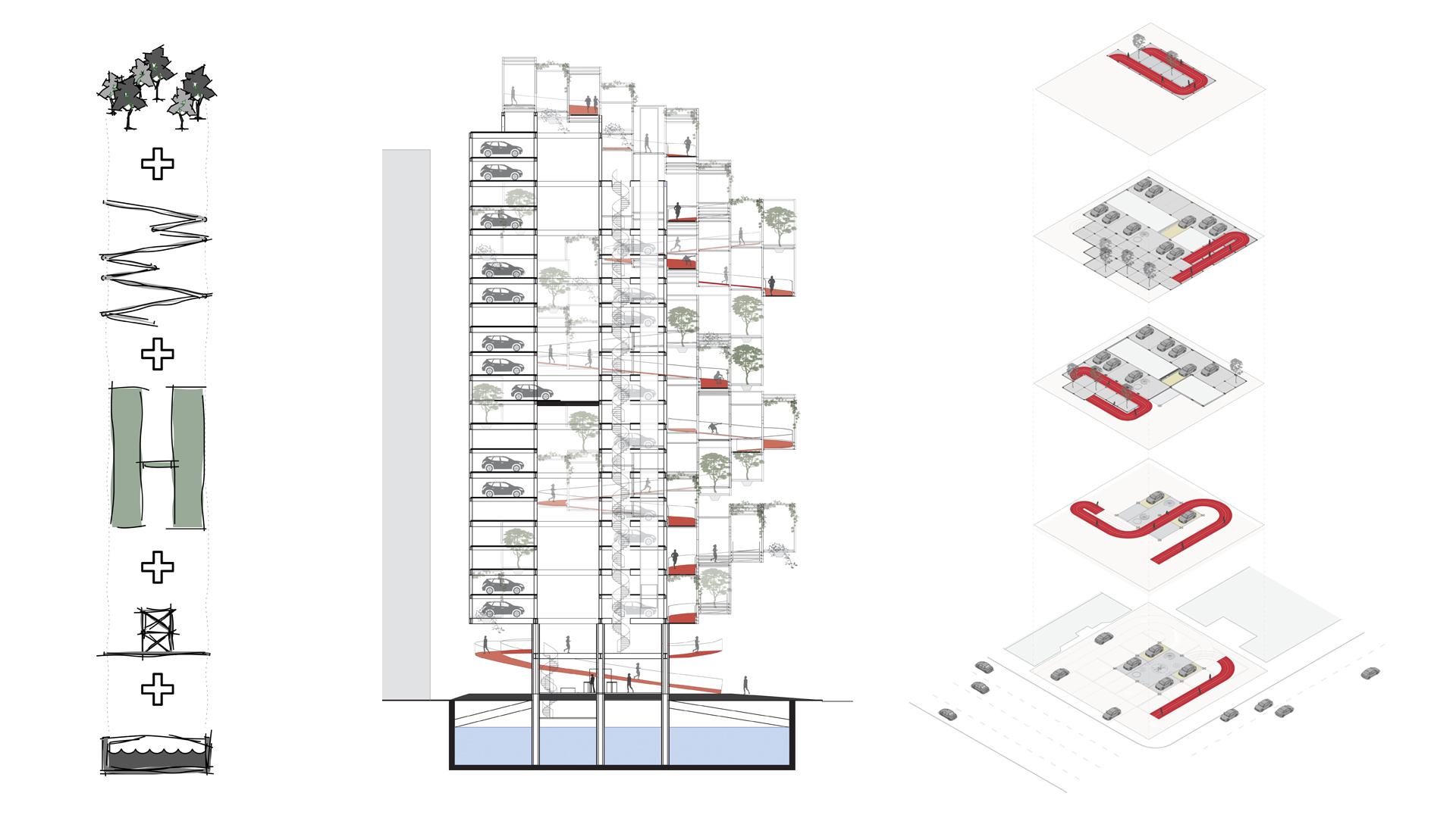
The residual space between the concrete foundation beams will be used as a water basin to accommodate at least 3.000.000 litres of storm water, ultimately due to harmful car emissions.
“Rather than enlarging the volume of the parking we strongly encourage the use of car sharing systems.”
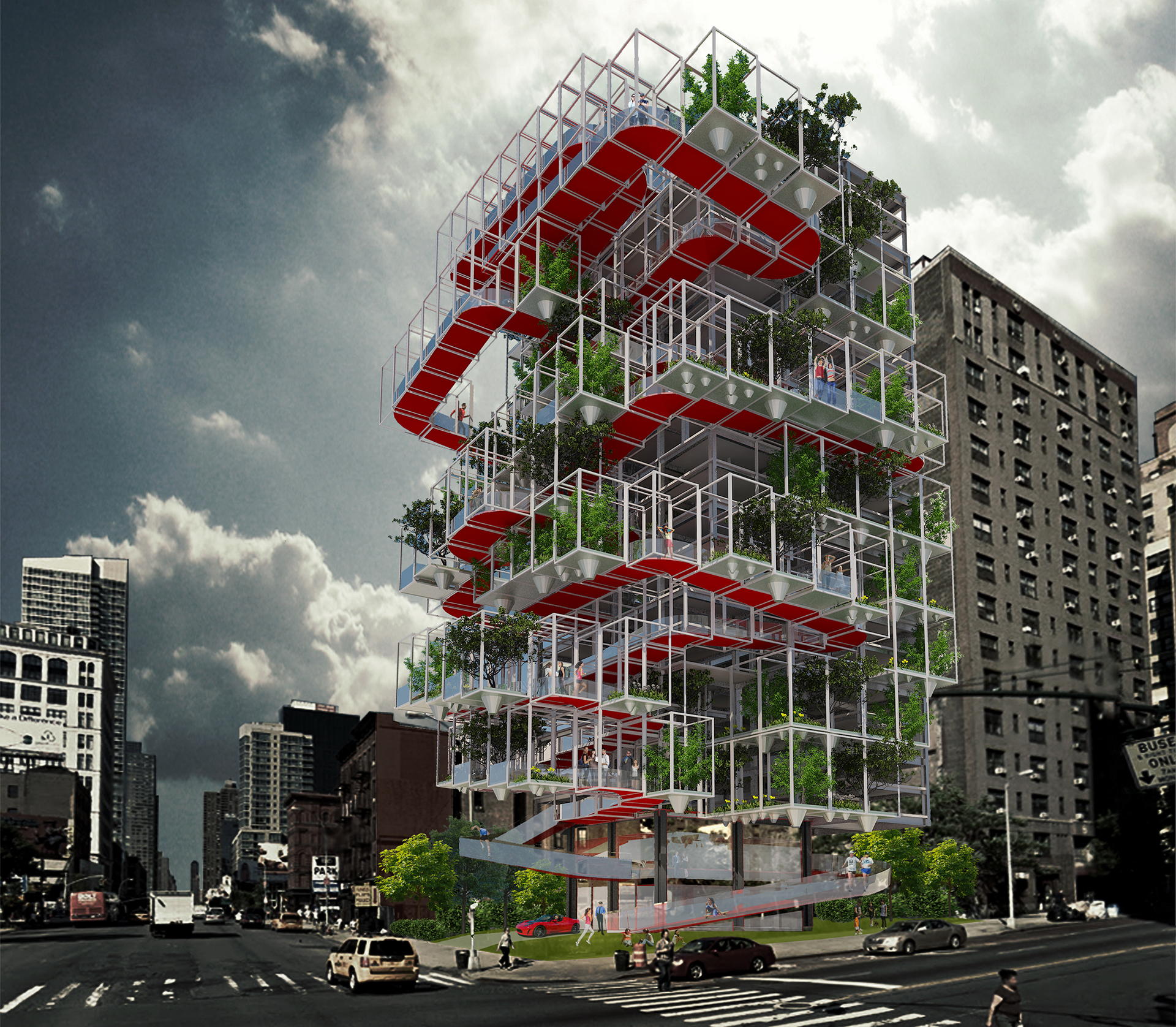
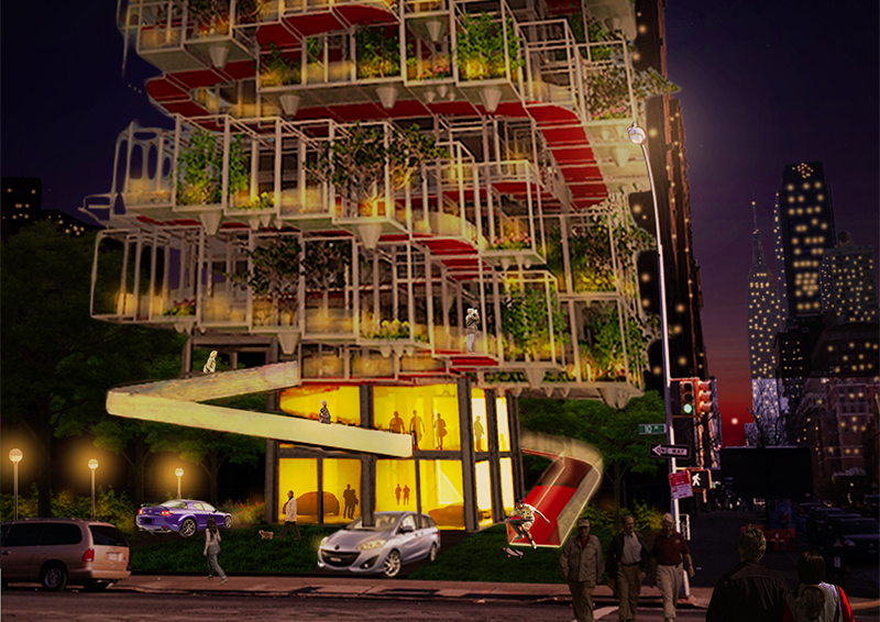
Air purifying green adorns the façade, literally and figuratively camouflages the cars. An irrigation system based on gravity and rainwater takes care of the shrubs and trees. A minimum of 300 cars can be stored in the parking area. Rather than enlarging the volume of the parking we strongly encourage the use of car sharing systems. This will increase the capacity of the garage without up scaling the building. The occurring efficiency is a first initiative to reduce the carbon footprint and the city’s congestion.
The basic structure consists of an elementary modular frame system. An elevator and staircase running the full height of the structure, ensure the accessibility of all floors even for the non ‘sporty’, elderly, or disabled visitor. By lifting the building’s main volume, its footprint is reduced to a minimum and thus allowing urban life to continue under the building. The tree-like structure provides commodious aperture allowing the passage of plenty of daylight on the ground floor.
Facts
Project name: Poor but Beautiful
Location: New York City [United States]
Site area: 900 m2
Credits
Design team: Tom van Odijk, David Baars, Pilar Sande, Evgenia Zioga


